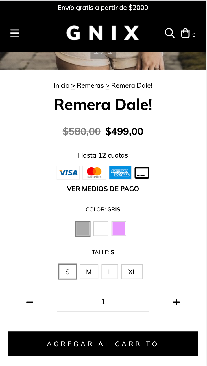
En el este artículo vamos a agregar nuevos botones para mostrar las variantes de la siguiente forma:
HTML
1. Dentro de la carpeta snipplets crear otra carpeta con el nombre product, dentro agregamos un nuevo snipplet llamado product-variants.tpl (si ya tenés este snipplet simplemente reemplazálo) con el siguiente código:
<div class="js-product-variants{% if quickshop %} js-product-quickshop-variants text-left{% endif %} form-row">
    {% set has_size_variations = false %}
    {% if settings.bullet_variants %}
        {% set hidden_variant_select = ' d-none' %}
    {% endif %}
    {% for variation in product.variations %}
        <div class="js-product-variants-group {% if variation.name in ['Color', 'Cor'] %}js-color-variants-container{% endif %} {% if settings.bullet_variants %}col-12 mb-2 text-center {% if not quickshop %}text-md-left{% endif %}{% else %}{% if loop.length == 3 %} {% if quickshop %}col-4{% else %}col-12{% endif %} col-md-4 {% elseif loop.length == 2 %} col-6 {% else %} col {% if quickshop %}col-md-12{% else %}col-md-6{% endif %}{% endif %}{% endif %}" data-variation-id="{{ variation.id }}">
            {% embed "snipplets/forms/form-select.tpl" with{select_label: true, select_label_name: '' ~ variation.name ~ '', select_for: 'variation_' ~ loop.index , select_id: 'variation_' ~ loop.index, select_data_value: 'variation_' ~ loop.index, select_name: 'variation' ~ '[' ~ variation.id ~ ']', select_group_custom_class:hidden_variant_select, select_custom_class: 'js-variation-option js-refresh-installment-data'} %}
                {% block select_options %}
                    {% for option in variation.options %}
                        <option value="{{ option.id }}" {% if product.default_options[variation.id] == option.id %}selected="selected"{% endif %}>{{ option.name }}</option>
                    {% endfor %}
                {% endblock select_options%}
            {% endembed %}
            {% if settings.bullet_variants %}
                    <div class="text-center {% if not quickshop %}text-md-left{% endif %}">
                        <label class="form-label mb-3">{{ variation.name }}</label>
                    </div>
                    <div class="text-center {% if not quickshop %}text-md-left{% endif %}">
                        {% for option in variation.options if option.custom_data %}
                            <a data-option="{{ option.id }}" class="js-insta-variant btn btn-variant{% if product.default_options[variation.id] == option.id %} selected{% endif %}" title="{{ option.name }}" data-option="{{ option.id }}" data-variation-id="{{ variation.id }}">
                                <span class="btn-variant-content"{% if variation.name in ['Color', 'Cor'] %} style="background: {{ option.custom_data }}; border: 1px solid #eee"{% endif %} data-name="{{ option.name }}">
                                {% if not(variation.name in ['Color', 'Cor']) %}
                                    {{ option.name }}
                                {% endif %}
                                </span>
                            </a>
                        {% endfor %}
                        {% for option in variation.options if not option.custom_data %}
                            <a data-option="{{ option.id }}" class="js-insta-variant btn btn-variant{% if product.default_options[variation.id] == option.id %} selected{% endif %}" data-variation-id="{{ variation.id }}">
                                <span class="btn-variant-content" data-name="{{ option.name }}">{{ option.name }}</span>
                            </a>
                        {% endfor %}
                    </div>
            {% endif %}
        </div>
        {% if variation.name in ['Talle', 'Talla', 'Tamanho', 'Size'] %}
            {% set has_size_variations = true %}
        {% endif %}
    {% endfor %}
</div>
2. Luego tenemos que crear una nueva carpeta con el nombre forms, ubicada en la carpeta snipplets. Dentro agregamos el snipplet con el nombre form-select.tpl, que vamos a usar para todos los componentes “select” dentro del theme (en el theme Base ya está agregado).
{# /*============================================================================
  #Form select
==============================================================================*/

#Properties

#Group
    //select_group_custom_class for custom CSS classes
#Label
    // select_label_name for name
    // select_label_id for ID
    // select_for for label for
    // select_label_custom_class for custom CSS classes
#Select
    // select_id for id
    // select_name for name
    // select_custom_class for custom CSS classes
    // input_rows for textarea rows
    // select_options to insert select options
    // select_aria_label for aria-label attribute

#}

<div class="form-group {{ select_group_custom_class }}">
    {% if select_label %}
        <label {% if select_label_id%}id="{{ select_label_id }}"{% endif %} class="form-label {{ select_label_custom_class }}" {% if select_for %}for="{{ select_for }}"{% endif %}>{{ select_label_name }}</label>
    {% endif %}
    <select
        {% if select_id %}id="{{ select_id }}"{% endif %}
        class="form-select {{ select_custom_class }} {% if select_inline %}form-control-inline{% endif %}"
        {% if select_data %}data-{{select_data}}="{{select_data_value}}"{% endif %}
        {% if select_name %}name="{{ select_name }}"{% endif %}
        {% if select_aria_label %}aria-label="{{ select_aria_label }}"{% endif %}>
        {% block select_options %}
        {% endblock select_options %}
    </select>
    <div class="form-select-icon">
        {% include "snipplets/svg/chevron-down.tpl" with {svg_custom_class: "icon-inline icon-w-14 icon-lg svg-icon-text"} %}
    </div>
</div>
3. Por último para la parte de HTML, necesitamos agregar una carpeta SVG dentro de la carpeta snipplets. Acá vamos sumar el SVG que usamos para la flecha dentro de los select de variantes con el nombre chevron-down.tpl
<svg class="{{ svg_custom_class }}" xmlns="http://www.w3.org/2000/svg" viewBox="0 0 448 512"><path d="M441.9 167.3l-19.8-19.8c-4.7-4.7-12.3-4.7-17 0L224 328.2 42.9 147.5c-4.7-4.7-12.3-4.7-17 0L6.1 167.3c-4.7 4.7-4.7 12.3 0 17l209.4 209.4c4.7 4.7 12.3 4.7 17 0l209.4-209.4c4.7-4.7 4.7-12.3 0-17z"/></svg>CSS
Requisito:
Tener agregados en tu diseño las clases helpers. Podés seguir este este pequeño tutorial para hacerlo (simplemente es copiar y pegar algunas clases, no toma más de 1 minuto).
1. Agregar los estilos dentro del archivo static/style-colors.scss.tpl
Agregamos el siguiente SASS de colores en style-colors.scss.tpl (o la hoja de tu diseño que tenga los colores y tipografías de la tienda). Recordá que las variables de colores y tipografías pueden variar respecto a tu diseño:
@mixin prefix($property, $value, $prefixes: ()) {
  @each $prefix in $prefixes {
      #{'-' + $prefix + '-' + $property}: $value;
  }
    #{$property}: $value;
}


{# /* // Buttons */ #}


.btn{
  text-decoration: none;
  text-align: center;
  border: 0;
  cursor: pointer;
  -webkit-appearance: none;
  -moz-appearance: none;
  appearance: none;
  text-transform: uppercase;
  background: none;
  @include prefix(transition, all 0.4s ease, webkit ms moz o);
  &:hover,
  &:focus{
    outline: 0;
    opacity: 0.8;
  }
  &[disabled],
  &[disabled]:hover{
    opacity: 0.5;
    cursor: not-allowed;
    outline: 0;
  }
  &-variant{
    display: inline-block;
    font-size: 10px;
    line-height: 10px;
    min-width: 24px;
    min-height: 24px;
    margin: 0 10px 10px 0;
    border: 1px solid rgba($main-foreground, .3);
    color: rgba($main-foreground, .3);
    border-radius: 2px;
    vertical-align: top;
    &-content{
      display: block;
      min-width: 12px;
      min-height: 12px;
      margin: 5px;
      line-height: 12px;
    }
    &.selected {
      color: $main-foreground;
      border: 1px solid rgba($main-foreground, .8);
    }
  }
}


{# /* // Forms */ #}


input,
textarea {
  font-family: $body-font;
}


.form-control {
  display: block;
  padding: 10px 8px;
  width: 100%;
  border: 0;
  border-bottom: 1px solid rgba($main-foreground, .5);
  -webkit-appearance: none;
  -moz-appearance: none;
  appearance: none;
  color: $main-foreground;
  background-color: $main-background;
  &:focus{
    outline: 0;
  }
  &-inline{
    display: inline;
  }
}


.form-control::-webkit-input-placeholder {
  color: $main-foreground;
}
.form-control:-moz-placeholder {
  color: $main-foreground;
}
.form-control::-moz-placeholder {
  color: $main-foreground;
}
.form-control:-ms-input-placeholder {
  color: $main-foreground;
}


.form-select{
  display: block;
  padding: 10px 0;
  width: 100%;
  border: 0;
  border-bottom: 1px solid rgba($main-foreground, .5);
  border-radius: 0;
  -webkit-appearance: none;
  -moz-appearance: none;
  appearance: none;
  color: $main-foreground;
  background-color: $main-background;
  &-icon{
    background: $main-background;
  }
}
2. Agregar los estilos dentro del archivo static/style-critical.tpl
Si en tu diseño usas una hoja de estilos para el CSS crítico, vamos a necesitar agregar el código debajo dentro de la misma, pero si no es el caso podés unificar el CSS de los pasos 2 y 3. en un solo archivo.
{# /* // Forms */ #}


.form-group {
  position: relative;
  width: 100%;
}
.form-group .form-select-icon{
  position: absolute;
  bottom: 12px;
  right: 0;
  pointer-events: none;
}
.form-row {
  width: auto;
  display: -webkit-box;
  display: -ms-flexbox;
  display: flex;
  -ms-flex-wrap: wrap;
  flex-wrap: wrap;
  margin-right: -5px;
  margin-left: -5px;
  clear: both;
}


.form-row > .col,
.form-row > [class*=col-]{
  padding-right: 5px;
  padding-left: 5px;
}


.form-label {
  display: block;
  font-size: 10px;
  text-transform: uppercase;
}
3. Agregar los estilos dentro del archivo static/style-async.tpl
Si en tu diseño usas una hoja de estilos para CSS asíncrono, vamos a necesitar agregar el siguiente código debajo dentro de la misma, pero si no es el caso podés unificar el CSS de los pasos 3 y 4 en un solo archivo.
{# /* // Forms */ #}


.form-group{
  .form-label{
    float: left;
    width: 100%;
    margin-bottom: 10px;
  }
  .alert{
    margin: 10px 0 0 0;
  }
}
JS
⚠️ A partir del día 30 de enero de 2023, la librería jQuery será removida del código de nuestras tiendas, por lo tanto la función "$" no podrá ser utilizada.
1. El JavaScript necesitamos agregarlo en el archivo store.js.tpl (o donde tengas tus funciones de JS). Agregamos el siguiente código :
{% if settings.bullet_variants %}
changeVariantButton = function(selector, parentSelector) {
selector.siblings().removeClass("selected");
selector.addClass("selected");
var variation_id = selector.attr('data-variation-id');
var option_id = selector.attr('data-option');
var parent = selector.closest(parentSelector);
var variation_select = parent.find('.js-product-variants-group[data-variation-id="'+variation_id+'"] .js-variation-option');
var selected_option = variation_select.find('option[value="'+option_id+'"]');
variation_select.find("option").removeAttr("selected");
selected_option.attr('selected', 'selected');
variation_select.trigger('change');
}
jQueryNuvem(document).on("click", ".js-insta-variant", function (e) {
e.preventDefault();
$this = jQueryNuvem(this);
changeVariantButton($this, '.js-product-variants-group');
});
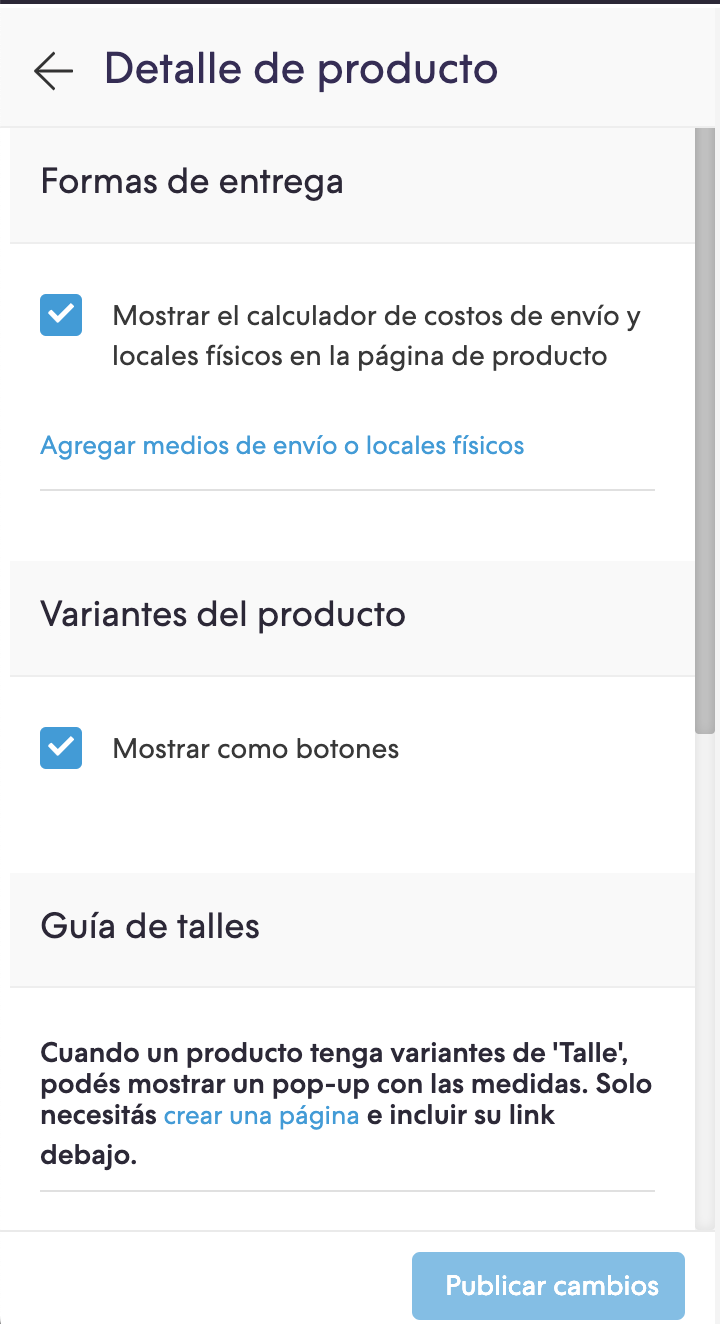
{% endif %}Configuraciones
En el archivo config/settings.txt vamos a agregar el checkbox que activa la funcionalidad dentro de la sección “Detalle de producto”.
title
    title = Variantes del producto
checkbox
    name = bullet_variants
    description = Mostrar como botones
Traducciones
Para terminar agregamos los textos para las traducciones en el archivo config/translations.txt
es "Variantes del producto"
pt "Variações do produto"
es_mx "Variantes del producto"

es "Mostrar como botones"
pt "Mostrar como botões"
es_mx "Mostrar como botones"

es "Talle"
pt "Tamanho"
en "Size"
es_mx "Talla"

es "S"
pt "P"
en "S"
es_mx "S"

es "M"
pt "M"
en "M"
es_mx "M"

es "L"
pt "G"
en "L"
es_mx "L"

es "XL"
pt "GG"
en "XL"
es_mx "XL"

es "Color"
pt "Cor"
en "Color"
es_mx "Color"

es "Azul"
pt "Azul"
en "Blue"
es_mx "Azul"

es "Blanco"
pt "Branco"
en "White"
es_mx "Blanco"

es "Rojo"
pt "Vermelha"
en "Red"
es_mx "Rojo"

es "Material"
pt "Material"
en "Material"
es_mx "Material"

es "Algodón"
pt "Algodão"
en "Cotton"
es_mx "Algodón"

es "Denim"
pt "Denim"
en "Denim"
es_mx "Denim"
Activación
Por último podés activar la funcionalidad desde el Administrador nube, en la sección de Personalizar tu diseño actual dentro del Detalle de producto:
Listo, ya tenés en tu diseño la funcionalidad aplicada ¡Excelente!